08 March 2010

Under Construction
by Frank Turk
Sorry for the dust and stuff. It'll get normal in a few hours.
_______________________
OK, as of right now we're running a blogger 2.0 template, and I think I have everything migrated from the old template to the new. It looks vaguely different. Except for the headlines which I have intentionally made sans-serif (at Phil's request).
So, enjoy insofar as you would enjoy something like this.
Subscribe to:
Post Comments (Atom)




27 comments:
What was it running before? Also, can I comment with my email and web address rather than my blogger account or OpenID?
The customized favicon is gone? It's just the Blogger "B" icon I see in my Favorites folder.
Sans serif?
Modernists....
Oh, thanks for mentioning the headlines. I probably wouldn't have even noticed, but now all I can see is the headlines. Every time I check into Pyro I'll be saying, "What's up with those headlines?"
And for pity's sake, not to start something, but since you're changing things, couldn't you simplify the word verification? Mine is, I kid you not, "elinspro." Really? Elin's Pro? We can have sans serif headlines but we can't improve on that?
The favicon completely got by me. I'll have to get that fixed some time today.
And we all know that Blogger's commenting system is horrific, but let's just be glad that we aren't using ECHO. Blech.
Sweet. Thanks for updating the template, Frank. Love it. You've fixed a dozen or more issues that have annoyed me for years.
For example, in the old template, you couldn't click on the title of a post to get the permalink. Now you can.
Also, the old format refused to show more than 200 comments, which meant our most interesting brouhahas always got cut short.
I'll work on some fresh graphics today. I'm still home with bronchitis.
site width is strictly constrained and it is cutting off the display of phil's twitter feed without a horizontal scroll option, no matter how wide my browser window is. I'm getting white space between scroll bar and right side of page, yet phil's twitter box is getting cut off still.
I like Gill Sans as a font. Especially in italics.
It's so English.
That doesn't look like Gill Sans (which I also like, along with its cousin, Johnston's Railway Type). Gill Sans upper case characters are more square.
And I love the verification words: they're pseudo-inspired.
The problem with Phil's twitter feed is new. I'll look at it tonight.
Not to be nitpicky, but while we're making changes...
Can we make it so the logo at the top of the page links to the homepage?
Stefan,
It's not Gill Sans here. I just meant that I liked Gill Sans as a Font.
When I saw "Sans serif," I thought it was a cousin of Omar Sharif. I stand corrected.
Was Stefan right about Phil's reasoning for keeping the font sans serif, namely, that a font with serifs is postmodern?
Is it for aesthetic reasons alone, or is there a deeper reason?
Grim:
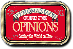
No. Click on the matchbox if you want the home page.
I thought the sans serif type would look good. Seeing it in action, I'm not so sure. Maybe if we unbolded it, or made it Cap & LC instead of all caps. I don't know. We'll probably play with it for awhile.
Didn't the old template go to home page if you clicked on the header art?
Both the matchbox and the header art link to the home page.
I'm also getting the problem of Phil's Twitter box getting cut off by a few pixels on the right side. I'm using IE8 in Compatibility view on Windows 7.
Peter:
Actually, my joke was working in the reverse direction. Serif fonts are pre-modern(ist), although they've enjoyed a resurgence since the 1980s—a little bit like Calvinism.
The accusation has been hurled that those adhering to Biblical theology are "modernist" (contra the self-styled "postmodernists" who hurl the accusation), but ironically, adherents of theological "modernism" were consciously rejecting Biblical theology in favour of something new and shiny, and were in some ways the direct precursors (which makes sense etymologically) of postmodernists.
Clear as mud, right?
I do like artistic modernism—mid 20th-century music, art, architecture, and graphic design (and fonts, too)—but having had my fill growing up of a modernistic, progressive, secular worldview, not so much the theological kind.
Let's try Arial Bold for the headlines. We'll run it a coupla days.
I love me some Arial Bold. It's got a Helvetica feel to it: the right kind of modernism.
This is getting depressing. Will I ever be able to drag my eyes off the headline font long enough to grasp the point being made in the article again? Maybe if I scroll down...
Word verification: "exhunnin" - formerly hunnin? What's a hunnin?
Chantry:
A "hunnin" is a historical far-eastern military fatal error.
As is:
If you want to ruin millennia of Chinese Dynasties, fine: let the hunnin.
"exhunnin" is the countermeasure to "hunnin". As in:
Let the exhunnin so he can tell us what Attila is planning to do and we can therefore squash his Mongolian keyster.
I love me some Arial Bold. It's got a Helvetica feel to it: the right kind of modernism.
Indeed, with the exception of a few angles and differences in proportion, Arial is nearly identical to Helvetica. Some other similar typefaces include Franklin Gothic and Univers. They all descend from Akzidenz-Grotesk, a sans-serif font designed in the late 19th century.
I'm a bit burnt out on Helvetica, because so many other designers out there are obsessed with it the past couple years (ever since there was a documentary about it). Plus, it's everywhere - it's even the font in subway systems and IRS tax forms. Helvetica is the Starbucks of typeface.
My favorite sans-serif is Gill Sans. My favorite serif is Garamond.
Citizen Grim:
True enough, to all of what you said.
Frank:
Brilliant!
Who let the Huns in? Who, who, who, who?
Twitter box issue fixed. Bug report closed :)
word verification: Limati. Is that the mix of a lima bean and the illuminati? hmmm
Hi,
Just to let you know your rss feed is broken (it is rsss.xml not rss.xml).
Chucky.
Post a Comment