
Howdy, gang. Phil's welcoming a day off, so I get to ask you to help me on something. (Of course, I hope Phil and Frank pitch in, too.)
My manuscript has been edited and submitted to Kregel and... well, I'm not sure just where it is. But meanwhile, I've been working with Kregel's Cat Hoort on other aspects of publication. Cat is Kregel's marketing manager who is overseeing the new release campaign for my book, The World-Tilting Gospel.
It's been a fun process, exciting and scary by turns. Cat's been very helpful, and great to work with. We have formalized the title (as you'll see), have worked on audience, presenting the book, and various forms of my bio for differing uses.
Now we get to pick the cover, and Cat suggested that I invite your input. Fun, eh? Ever do this before? Me either!
First, here are the two main candidates, presented in random order:
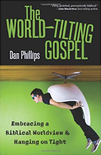
Cover A

Cover B

Second: your job is simply to say which you find more eye-catching and, if you don't mind, briefly explain why.
Now I realize that, at this point, you don't know a whole lot about what's inside the book. Actually, that's the point. Kregel wants to know: Which of those books look like anything you might pick up, flip over to read the back cover, and then maybe page through?
Two more things, both optional — well, the whole thing's optional, but I digress:
- If you don't mind, would you either give your age, or age range (i.e. 20-25, 95-100, whatever)? Be truthful, now.
- Do you have any position in a church — pastor, secretary, Sunday School teacher, Bible study leader, etc.? Share.
Thanks, I really do appreciate it, and hope it's some kind of fun for you, as this one was.


237 comments:
«Oldest ‹Older 201 – 237 of 237A retired RN mom of 7 never gives her age .. Because I am female and PCA I can only make coffee :)
I am not "in love" with either but no question that B is the best of the 2
The color on A catches the eye buy the art is dated looking..
B makes you wonder what is in the book
I opt for the Cover 1, because it clearly states the theme of the book. Though the design may resemble the 1970s or 80s. A new reader will easily understand the theme of the book by seeing the cover. Also I always like these kind of artwork. They look good.
I'm 33 and serve as a pastor (Southern Baptist church plant). I know the book is going to be great. The selling point for me is the fact that it says "Dan Phillips," BUT as far the covers go the 2nd cover is more eye catching. It's not "great," but it's better than the first one.
Hi Dan,
The 2nd one ( egg chair ), for sure. The first one looks old/dated.
The 2nd is much more eye catching and I think is more likely to make folks pick it up..if for no other reason..to turn the poor guys right side up and..gulp..stop the vertigo.
I'm 43 and a deacon.
Sorry, haven't read the rest of the comments - Cover 2 gets my vote as it is more visually striking. The greens really catch my eye. I like that the man is sitting in the chair incorrectly adding to the confusion of him hanging upside down.
I don't like cover 1 because it doesn't make the world look like it is tilted. Maybe if the earth and the words were tilted so the word "tilting" was level it might have a better effect (but I'm no graphic designer/artist)
40 years old and a pew-warmer from Australia
I like the first one more. The second one looks like it wouldn't stand out in the book store as it looks like a lot of other Christian book covers.
I'm 27.
I am a graphic artist with a few book covers under my belt. (I don't mean I stole them...I created them) Cover B is one that would catch attention and that's half the battle.
Go for B and you won't B sorry.
i like the 2nd cover.
i'm 36, but I'm really mature for my age (i act more like i'm 37). i'm a pastor.
i like long walks on the beach, going out to the movies, and poetry.
LOL
Disappointed the graphics are nothing like the great ones here at this site. The second cover is too hoaky and emergent. I agree, when someone other than the author is on the cover; I don't buy the message. Please start over.
My suggesstion, though not requested, is to use the incredibly creative type graphics enjoyed at this site using the world instead of the round Pyro logo. Paint pouring is always eye-catching to me because of the triggers from color, texture, scent and emotional gasping of the horror of spilled paint.
Great picture of the face, btw.
Thanks for not putting a roller-coaster on the cover. If Cat even suggested it, be afraid.
51, female, chaplain in Gideon Auxilliary. Former children's ministry pastor and retired science teacher.
Looking forward to reading the book.
I like cover B because it visually fits the title well.
Also, it has a really hip, relevant look to it that may get the truth out to some emerg*** types who mistakenly think that they are buying some Rob Bell, Donald Miller or Brian McLaren type book.
I am 50 years old and I am an an Awana leader and assistant children's Sunday School leader at our church.
31, no official position at church (occasional teacher).
Cover 2 is better, though I like neither.
#1 is too retro looking, cluttered, and kind of annoying.
#2 looks to be trying too hard to be contemprovent and is kind of annoying.
If I didn't know who Dan Phillips is and saw either at a bookstore - I would pass without a second look.
I like cover 2. It is easier on the eyes-the colors are better and the title stands out better. I would be much more inclined to pick up cover 2 and thumb through it.
I teach the Bible study for the women of my church-I will be 62 tomorrow.
I think the first cover is more appealing. The second cover doesn't stand out at all. It looks like a lot of other generic books, posters, and Sunday school material that is geared towards older teens/early twenties. You know, the "radical" and "extreme" look is really present on the second one. Plus, I'm really partial to the crisp, vintage suit and hat combo on the first cover. I'm 27 with no official leadership position in my local assembly.
I don't mean to be harsh, but if I didn't already know you and the quality of your writing, there is no way I'd pick-up either of these. It feels like a decision between eating raw brussel sprouts or cauliflower when I'm craving steak. I really don't like either cover because A seems like a lame attempt at going retro, and B's color scheme is unappealing. If forced to chose I'd take B. Having said that, I will be purchasing your book(s).
Small group leader, former teacher in a Christian school; age 30.
While I previously stated I could not care less about the cover graphics, I should have added that in shopping for books I typically look through the Table of Contents, skim the intro and first chapter and then make a decision.
Note to readers everywhere: NEVER judge a book by its cover!
I am a graphic designer/photographer/yearbook teacher and I really like the first one and really dislike the second one. I prefer an illustration to a photograph on a cover - it just piques my interest more. Just a suggestion (not that you don't already have a bunch of them!) I would clean up the first one just a tad - a little heavy on the grunge. I'm all about whimsical and the second one looks a little stodgy, but maybe that's what your going for:D
Late to this. I have been busy entertaining guests (they are gone now). I like and dislike both covers. The first appeals to me because I like the artistic style, the second because of the colors and crispness. I think they both miss the mark though. I want to see something in the picture tilting to fit the title; instead, things are upside down.
Fifty-two, elder's wife, preschool Sunday school teacher, Awana leader, etc.
Looking at the newest comments, Dan, I wonder if you can do Cover B in a cartoony way (a la Cover A). Just a thought. :)
I'm 42. I lead a young college/career discipleship group and I edit messages for our church radio program.
I choose B. It's definitely more eye-catching. I don't understand book publishing and selling, but I would think you would want your books to be eye-catching to sell at a Borders or something and the second book cover will catch someone's attention who doesn't know you to at least pick up the book and look at it.
I like cover A a little more cuz it's more abstract looking, and frankly it's colour scheme a little "christmassy".
The other one looks too trendy "Rob Bellish".
I think the 2nd cover will likely be more attention grabbing though.
...Oh, and I'm Pierre, I'm 38, and a sometimes adult Bible Study teacher...otherwise a wretched man Romans 7:24
Cover B is growing on me. If they can de-trendify it a little, and maybe change the colour scheme.
Anyway...looking forward to the book!
A professional critique from my husband and myself, both artists with over 50 years of combined graphic design/illustration experience:
Neither of us find either cover compelling. Both covers look like grade B magazine illustrations.
The first cover has a slightly retro feeling, but the use of fonts and the color choices are flat and do nothing to convey the message/meaning of the book. The second cover is more contemporary, but is even more flat and seems to have (dare I say it) an almost Emergent appeal.
We would scrap both covers.
Oh, and husband(46) is an elder and I am a Bible study leader (48).
26 years old. Elder at my church in Brazil.
Second cover!
Cheers and good luck with the launch.
Daniel
Looks like you have an emergent-cy on your hands, Dan.
(Sorry, just had to get it out. Can you believe you're at 228 comments??)
I like the second cover, I think it conveys the meaning of the title better. I'm 34 and am a church secretary and work with the youth at our church. I'm pretty sure I could get some of the group to read it with that second cover, it's clever!
Definitely cover A. It looks more like you ;)
I just turned 30, and have been very involved in youth ministry. Cover B just looks like an old person trying to do something cool, but not really fooling anyone under 30. I must say, I would also be less embarrassed to be out in public reading cover A than B, because cover B is trying too hard. B is kind of like the 40 yr. old youth pastor thinking that by wearing skinny jeans and leather jackets with lots of hair gel will fool anyone (an likeness to Mark Driscol in this description is entirely coincidental). I would rather see you portray yourself as the classy older guy you are. Be the cool old guy, not the old guy trying to be cool :)
Yeah... I'm just going to go spend the rest of the day figuring out how I feel about that one....
Im 30 and help lead the usher team at a church plant in NYC.
Cover A is by far my preference. It simply comes down to originality, and the second looks like it has been done 10 times before on other Christian books.
I like the first one better. The 2nd one with the kids in shades sitting in the "egg chair" seems overdone... I've seen that in TV commercials and ads for loud speakers and killer video games. So, my vote goes for the first one.
So overall, there are fewer votes for A, but that's counterbalanced by the fact that we are correct.
I'm 62, with no position in the church and I'm afraid I dislike them both.
An earlier comment got me to thinking, are you talking about tipping the World or righting it?
Either way I would suggest that the picture should show the World being moved.
OK, so I'm too late, I always am, I don't care.
I think my wife would love the first one, but I prefer the second. I am a 29 year-old seminary student. I'd like your book to disprove the old publishing myth that "green covers don't sell."
This comment is coming from a 20 year old with no position in a church (though I am off to Seminary soon).
It seems to me that cover #2 is more likely to catch my eye but I prefer cover #1. The reason #2 catches my eye is that it looks like something that would have Rob Bell's name on it (I tend to notice books on the shelf that would send me into a frustrated rant), that is it seems more "trendy". I appreciate cover #1 because it is simple and not over the top. I am much more concerned over the content within, not a "cool" or "trendy" cover.
I hope this helps.
I like cover B. Although, you should consider redoing the picture. It's clear that he is sitting upside down, whereas if he were gripping a little harder on the chair, you might fool people for a little bit longer.
Anyway, the second cover is definitely one that I would pick up and browse for a minute. The green stands out too. And it looks clean.
I'm 26 and a former Youth Pastor, current Small Group Leader and discipler in my church.
Post a Comment